
Project Overview
VoteSmart is a civic information platform designed to help users easily understand who represents them, explore candidates and issues, and prepare for elections with a clear, accessible UX. The product simplifies complex political information through a structured design and user-centered interaction.

The Problem
Many citizens struggle to find clear, accurate, and unbiased information about who represents them in government due to complex official websites, biased news coverage, widespread misinformation, and the effort required to verify information across multiple sources. These challenges underscore the need for a clear information hierarchy, simplified interaction flows, and transparent sourcing to help users navigate political information with confidence, without feeling overwhelmed or misled.
The Goal
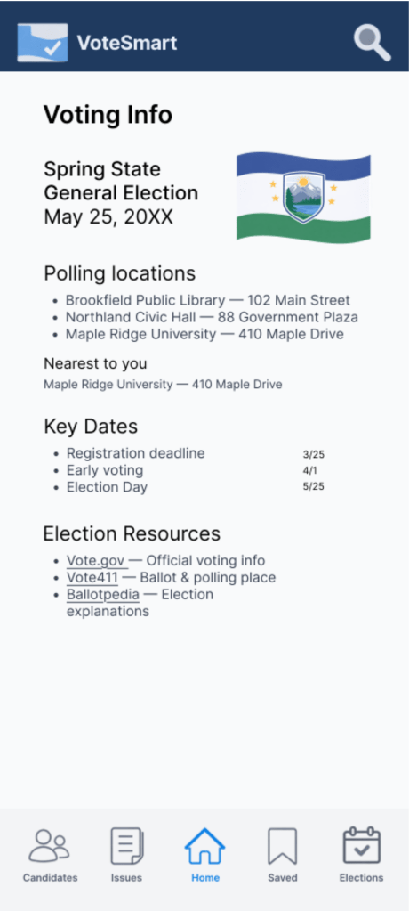
VoteSmart will help users identify who represents them at the state and federal levels, offering a simple, neutral, and straightforward way to consume civic information. The primary UX objective was to reduce friction when identifying representatives and understanding election information by minimizing steps, improving discoverability, and presenting content in digestible visual formats.
Pain Points
Tech illiteracy
Civically engaged users struggle to find accurate information due to government and political websites that are complex, unclear, or poorly maintained.
Polar media
Biased reporting from many news outlets can confuse voters and make it difficult to form informed, balanced opinions.
Fake Information
Political misinformation, especially on social media, including fabricated or AI-generated content, misleads users and distorts their understanding of civic issues.
Information Overload
Many users feel overwhelmed by the sheer number of information sources available and are often unwilling to read even a single article, let alone compare multiple sources to ensure an unbiased understanding.
Research identified several key challenges: difficulty finding trustworthy information, overwhelming amounts of political content, unclear ballot structures, and limited understanding of local representation. These insights guided the design toward clarity, neutrality, and simplified interaction flows.
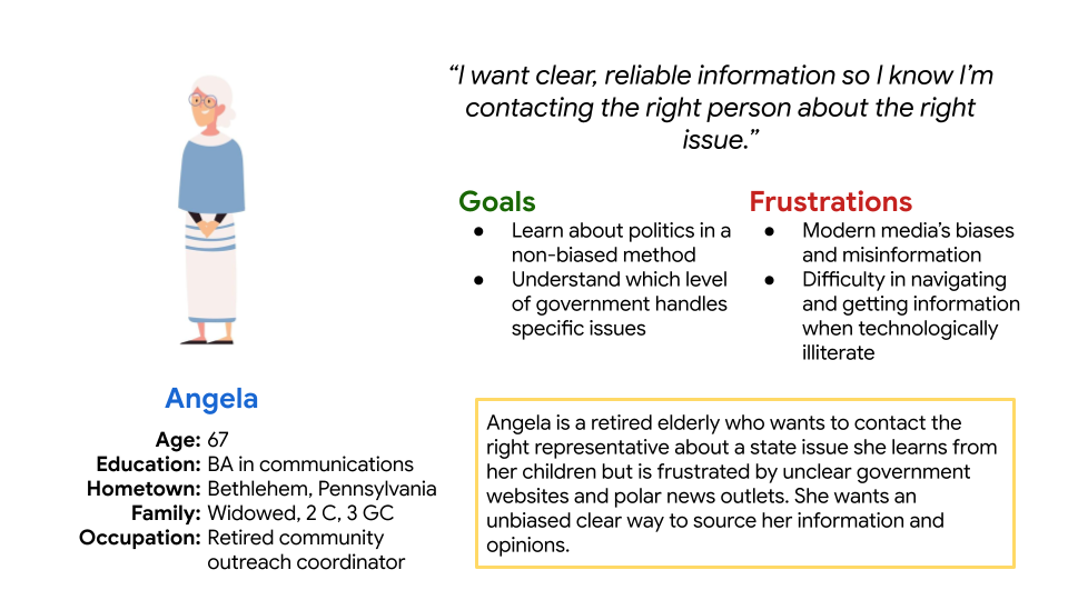
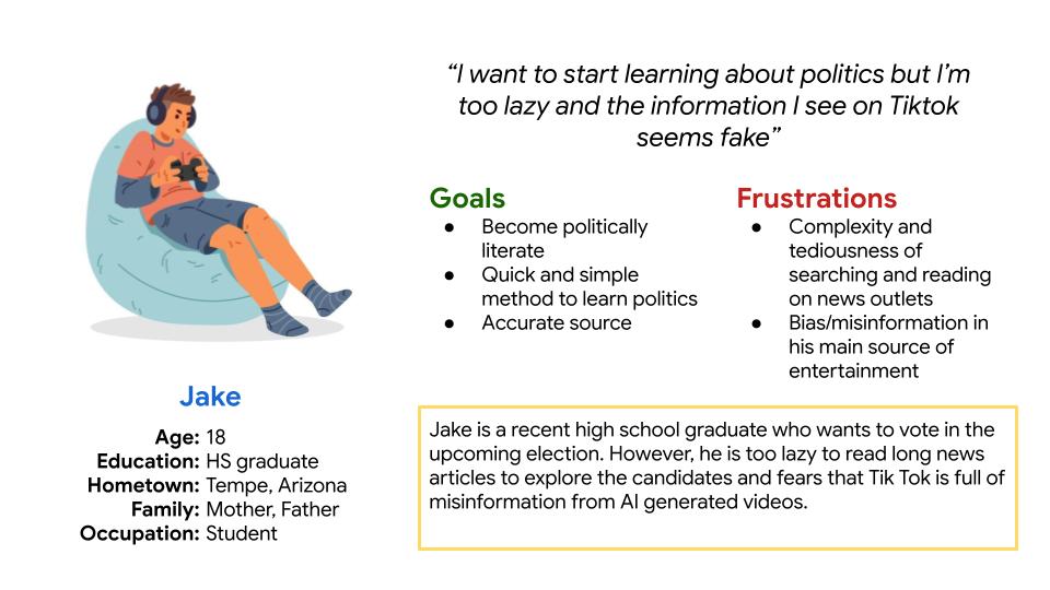
Personas
Created to represent key user types and guide design decisions based on their goals, needs, and challenges.
Personas represent potential voters with varying levels of civic knowledge and technological comfort. They helped guide decisions around accessibility, language clarity, and navigation simplicity to ensure the platform supports both first-time voters and experienced users.
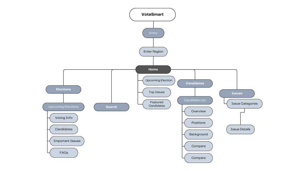
Information Architecture
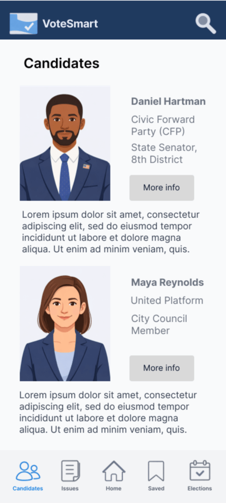
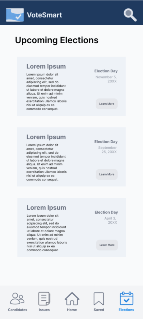
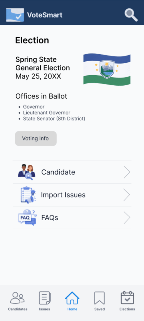
The information architecture organizes content around user goals rather than political categories. Users move from onboarding to finding their representatives, exploring candidate profiles, and accessing election information through a clear, task-focused structure.
Wireframes
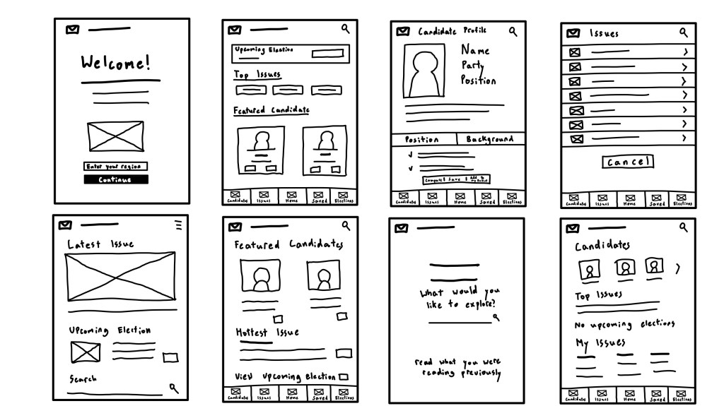
Paper Wireframes
Initial sketches explored different layout structures and navigation patterns to determine how civic information could be presented clearly without overwhelming users. Rapid iteration helped refine hierarchy and prioritize essential content.
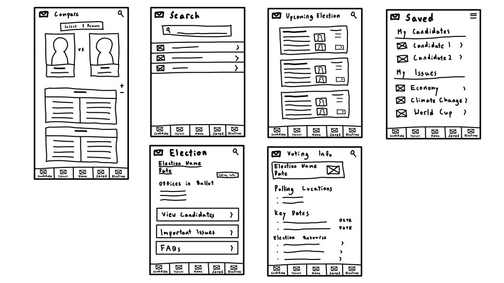
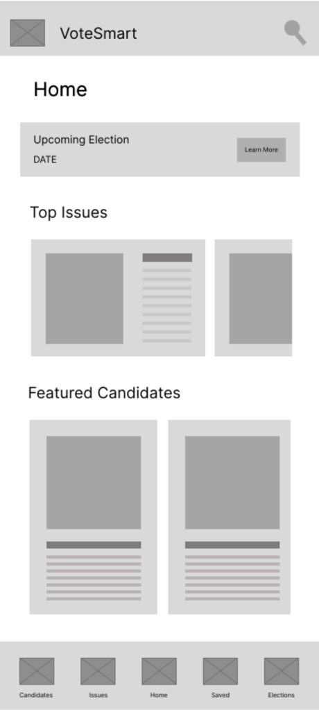
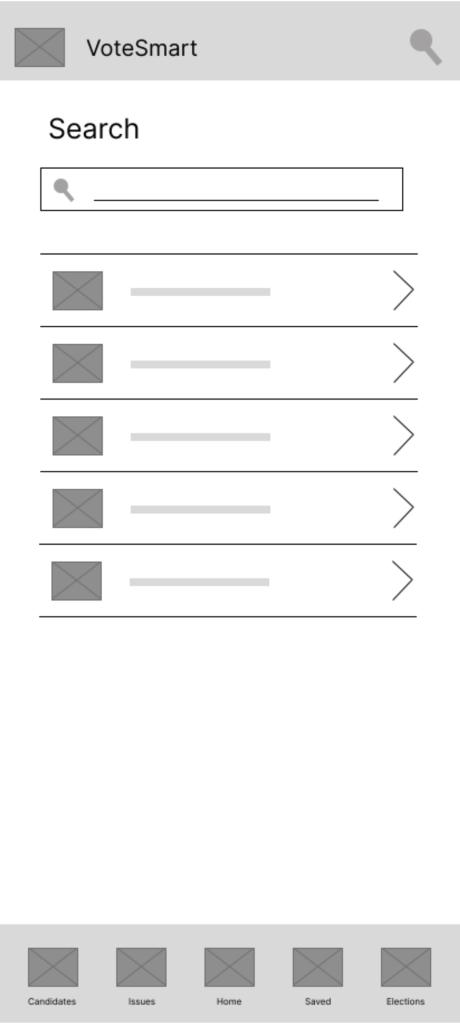
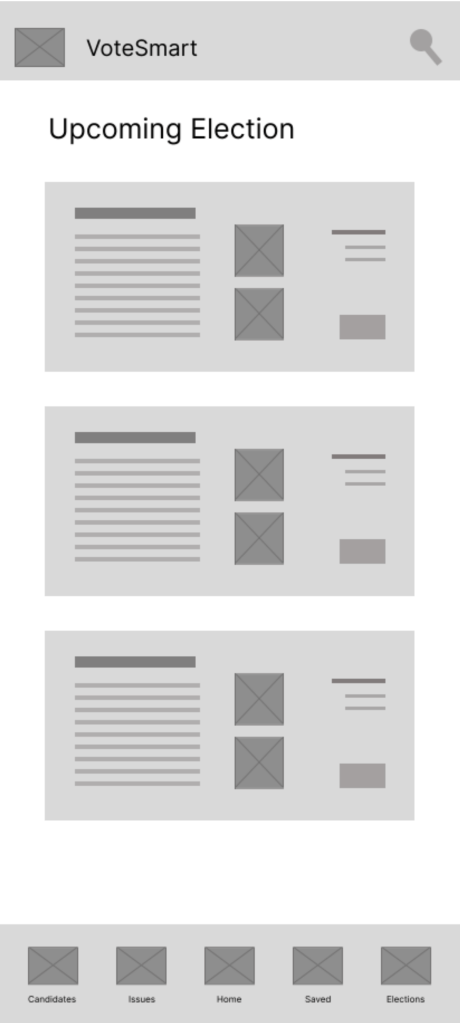
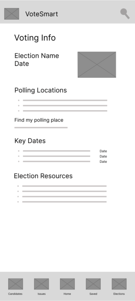
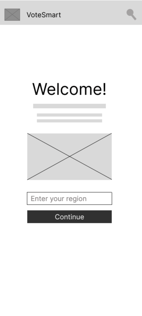
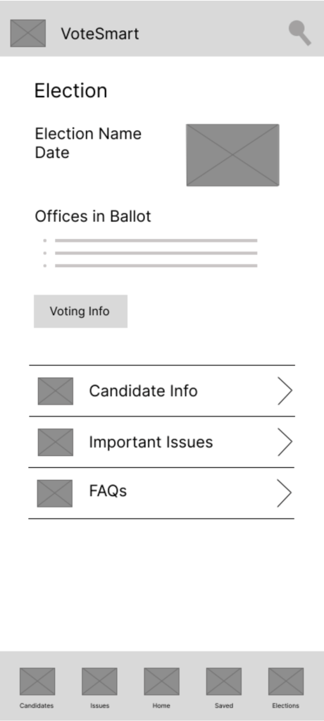
Digital Wireframes
Digital wireframes translated early concepts into structured screen layouts, refining spacing, content grouping, and navigation pathways. This stage ensured usability and clarity before introducing visual styling.
Mockups
High-fidelity mockups introduce a neutral and readable visual style designed to build trust and reduce bias perception. Typography, spacing, and color choices emphasize clarity and accessibility while supporting quick scanning of political information.
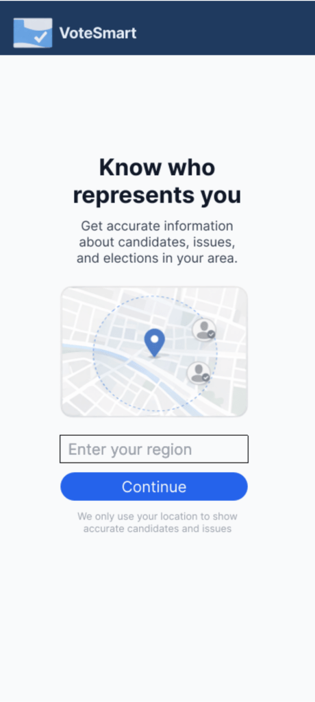

The interactive prototype demonstrates key user flows such as onboarding, locating representatives based on region, and navigating candidate profiles. These flows allow evaluation of usability and interaction clarity.
Tackling Pain Points
Challenge 1
Tech Illiteracy
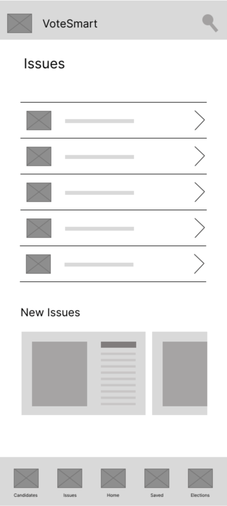
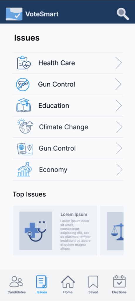
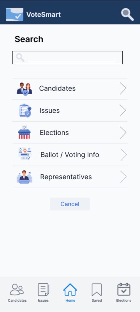
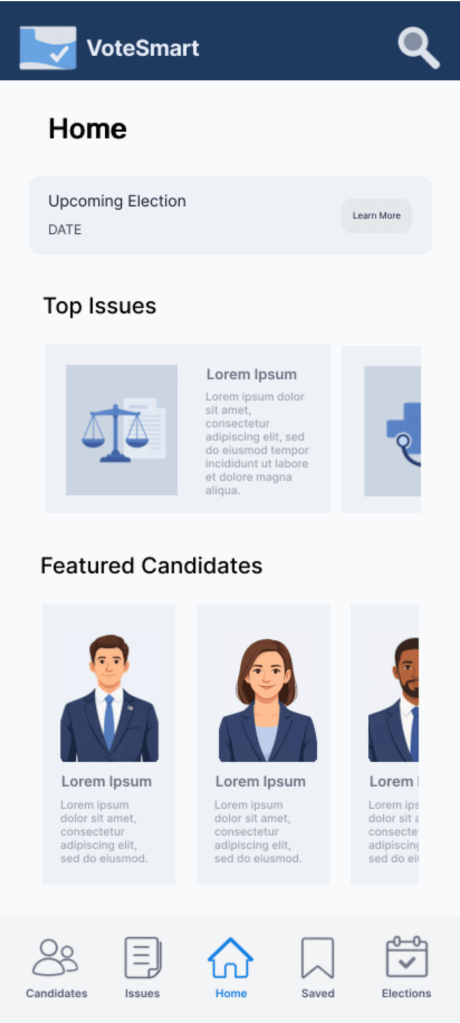
To address tech illiteracy, the VoteSmart interface prioritizes simplicity, clarity, and familiar navigation patterns. Information is organized into clear sections such as “Top Issues,” “Featured Candidates,” and upcoming election details, allowing users to quickly understand where to go without prior technical knowledge. Large visual cards, recognizable icons, and a consistent bottom navigation bar reduce cognitive load and make core actions intuitive. By minimizing complex menus and presenting information in structured, digestible blocks, the design helps users with lower digital confidence navigate civic information independently and efficiently.
Challenge 2
Polar Media
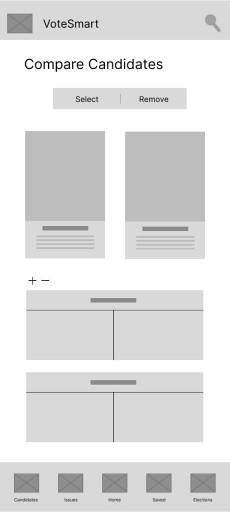
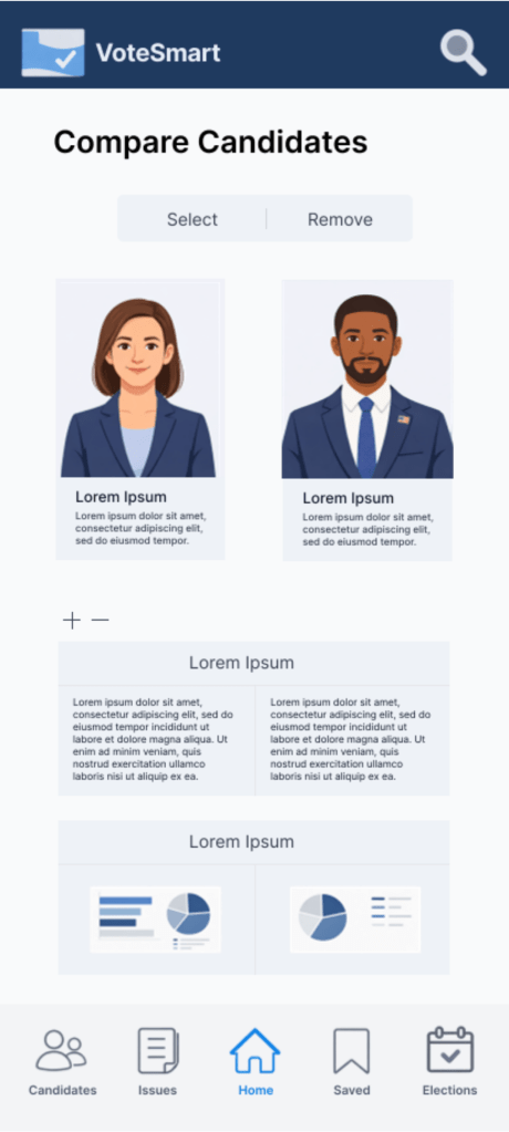
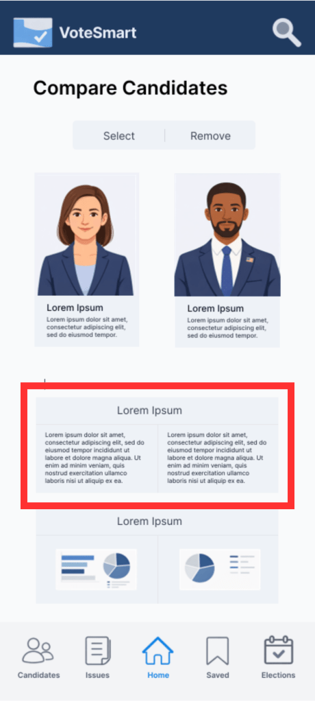
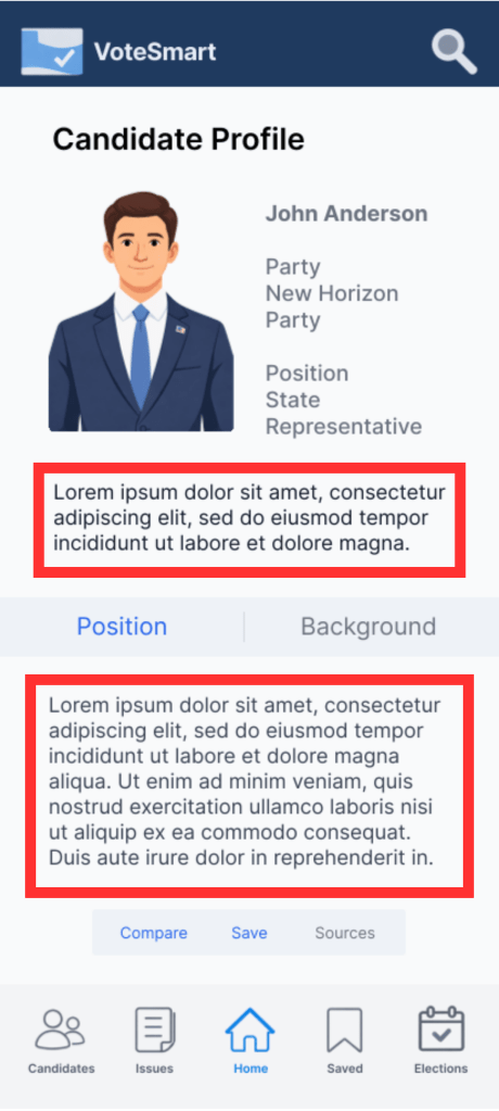
To address bias commonly found in traditional media, VoteSmart introduces a direct candidate comparison feature that presents information side-by-side in a structured and neutral format. By aligning key details under consistent categories, the design reduces reliance on external interpretation and allows users to evaluate candidates objectively. The clear visual grouping and parallel layout help users quickly identify differences without navigating multiple sources, supporting informed decision-making through transparent and unbiased presentation.
Challenge 3
Fake Information
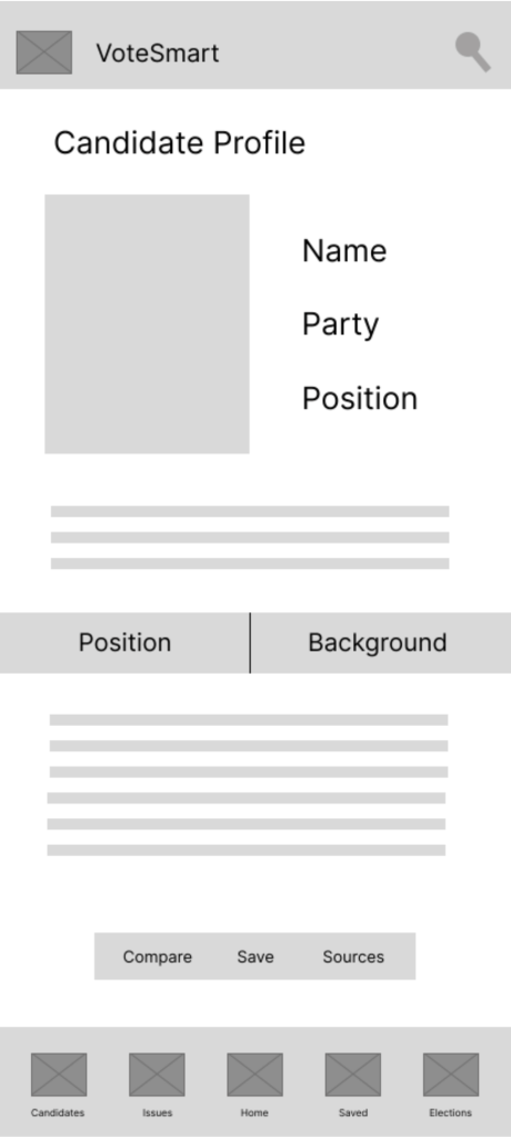
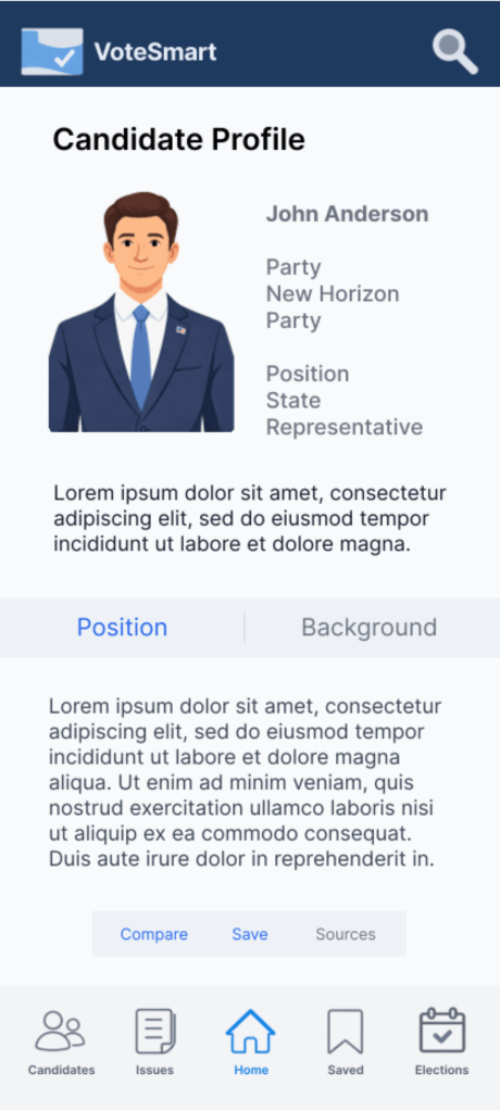
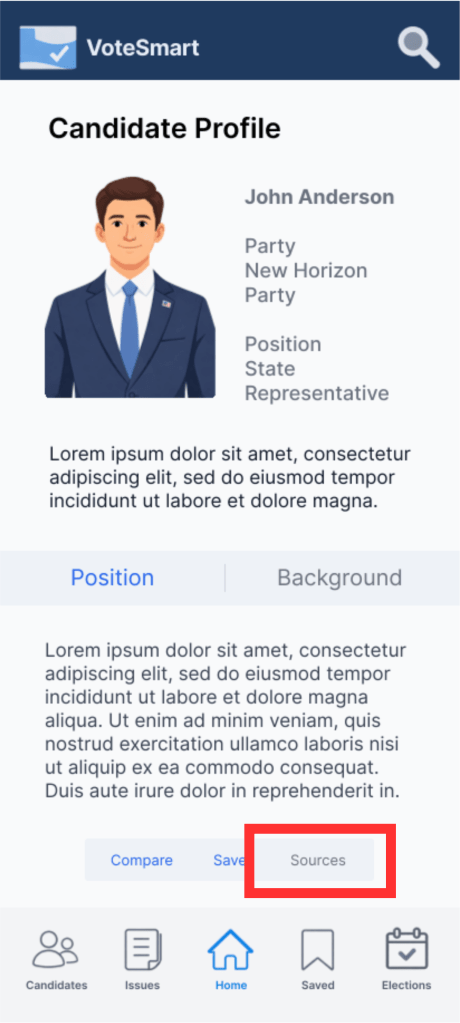
To combat misinformation, VoteSmart integrates clearly visible source references directly within candidate profiles. Providing accessible source links allows users to verify information independently, increasing transparency and trust. By embedding sources within the interface rather than requiring external searching, the design encourages informed decision-making and reduces the risk of users relying on unverified or misleading information.
Challenge 4
Information Overload
To reduce information overload, the design separates content into layered levels of detail. A concise summary is presented at the top to give users quick understanding, while a more detailed explanation is placed below for users who want deeper context. This progressive disclosure approach helps prevent cognitive overload by allowing users to scan key information first and access additional details only when needed, supporting both quick browsing and deeper exploration.
Style Guide
Sticker Sheet
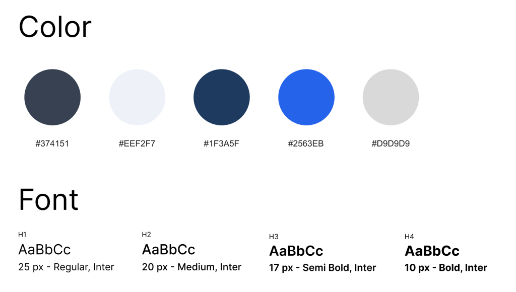
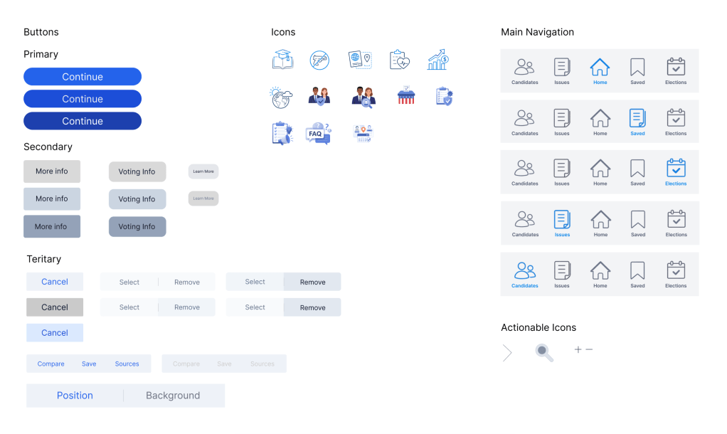
The design system establishes consistent UI components including buttons, typography styles, and navigation elements. Standardizing these components ensures scalability and visual consistency across the VoteSmart platform.
Designing VoteSmart highlighted the challenge of presenting complex civic information in a clear, neutral, and accessible way. Through iteration, I learned the importance of strong information hierarchy, task-based navigation, and maintaining visual neutrality to build user trust when working with political content. Developing personas and structuring the information architecture helped shift the focus from features to real user goals, such as quickly finding representatives or understanding candidates.
Next steps include conducting usability testing to identify friction points, improving accessibility and clarity of language, adding structured candidate comparison tools, and refining onboarding to better support first-time voters. Future iterations would also expand responsive design to ensure consistency across devices.
